What the graph shows
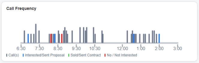
The Call Frequency graph plots individual calls throughout the day. Instead of focusing on totals, it focuses on timing. Each vertical marker represents a call, making it easy to see bursts of activity, slow periods, and overall calling rhythm.
Different colors indicate different outcomes, allowing you to see not only when calls occurred, but what happened during those conversations.
Why it matters
Most reps know how many calls they made. Fewer know when they made them. Two reps can end the day with identical call counts but completely different productivity patterns.
The Call Frequency graph exposes clustering, procrastination, post-lunch slowdowns, and other habits that are difficult to recognize from totals alone.
Consistency wins. A steady stream of calls throughout the day usually produces better results than frantic bursts separated by long gaps.
How to use it
Look for periods where activity drops unexpectedly. Compare busy periods against successful outcomes. Use the graph together with Pace, Goals, and Idle Time to understand not just how much work was done, but how the day unfolded.