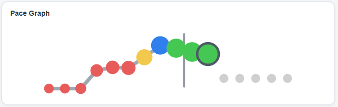
What the graph shows
The Call Pace graph breaks the day into time blocks and compares actual calling activity against the pace needed to hit the daily goal. Each dot represents a point in the day, and the color shows how healthy the pace is at that moment.
Instead of waiting until late afternoon to discover that the day has slipped away, the graph gives the rep an immediate read on momentum. If the dots are red, the day needs attention. If they are yellow, the rep is close but should push. Blue and green indicate stronger pace.
Why it matters
Sales productivity is often lost in small gaps, slow starts, long pauses, and hidden drift. The pace graph turns those invisible losses into a simple visual signal, helping reps correct course while there is still time to make the day work.
Its purpose is not manager surveillance. It is a rep-centered coaching cue: keep moving, protect the rhythm of the day, and make the next call before momentum fades.
The goal is simple: fewer surprises at the end of the day, more useful feedback during the day, and a better chance of finishing on target.